SageGlass Rebrand
AGENCY
FAST HORSE
ROLE
BRAND DESIGN
As an early entrant into the cutting-edge field of electrochromic (smart) glass, Faribault, Minnesota-based SageGlass had built a reputation for quality and innovation. Their acquisition by global building materials leader Saint-Gobain afforded the SageGlass an opportunity to refresh their brand and strategic positioning.
Logo Redesign

OLD LOGO
The rebrand design process began with a new logo. SageGlass came to us with a logo that, while building equity in a distinctive brand color (yellow) among smart glass competitors, had limitations representing the SageGlass name. Furthermore, SageGlass needed to align with the brand standards of its new parent brand. Our logo solution was a logo mark that represented both panes of glass and could be interpreted as both an “S” and a “G”, alongside a strong wordmark incorporating Saint-Gobain.
Brand Positioning

After a strategic analysis of the brand, field and target audiences, we determined that SageGlass had the opportunity to communicate its value of offering distinction without compromise. The light-filtering features of its smart glass allow architects and builders to think differently about light and sustainability. SageGlass removes the limitations of traditional glass, including glare and energy inefficiency. In a couple words, SageGlass allows clients to Build Unbound. This became the position that guided all brand communications.
Brand Design
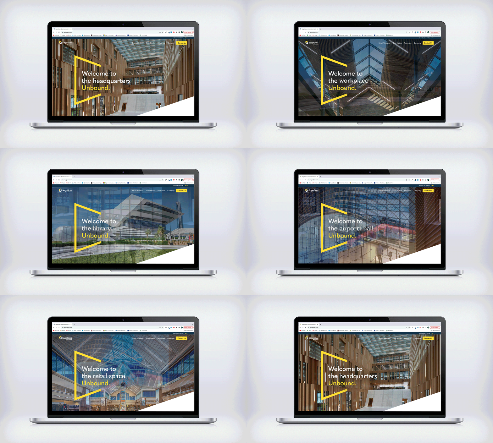
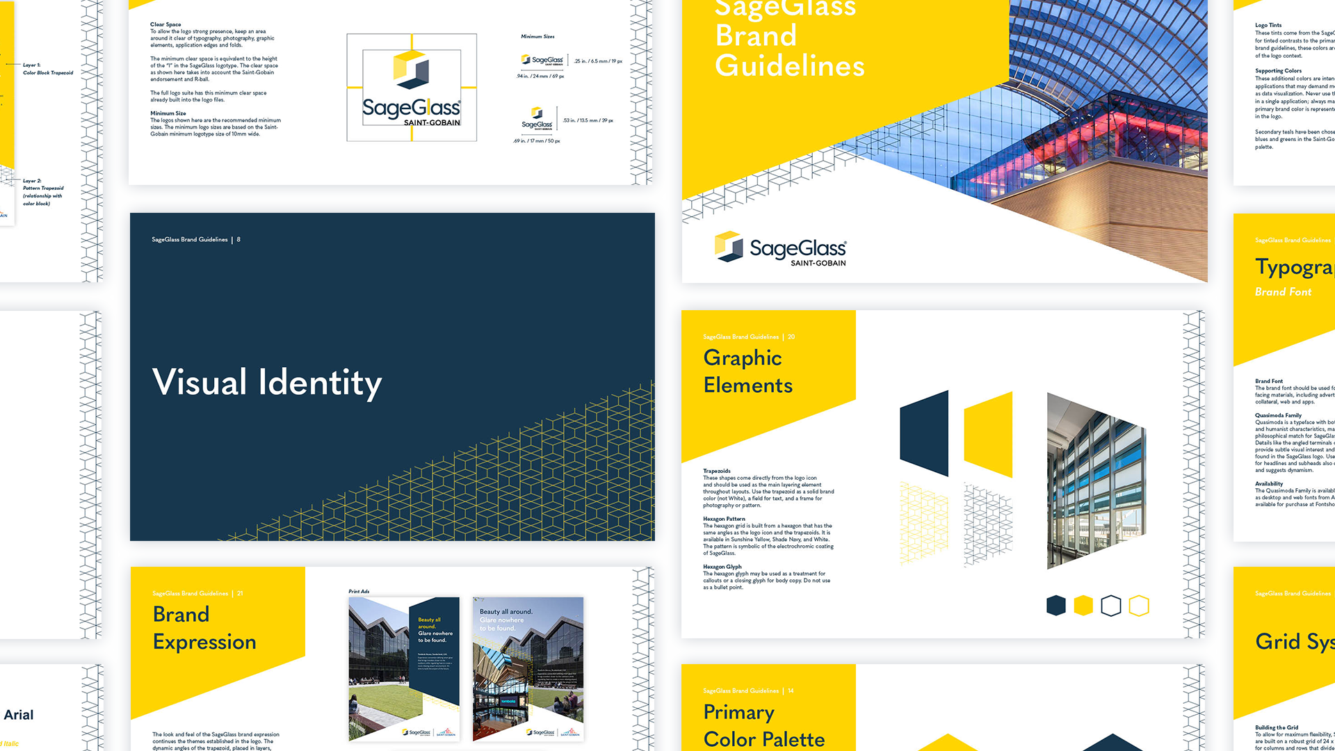
With the logo and brand positioning set, we developed out the brand identity, expanding upon the idea of window panes and the electrochromic technology at the core of SageGlass. We built brand guidelines, campaign collateral, brand templates and more, and consulted on the redesign of the SageGlass website.


WEBSITE HOMEPAGE (CONCEPT)

PRINT AND DIGITAL BANNER LAYOUTS

BRAND GUIDELINES
TESTIMONAL (ANIMATIONS)